







SkatePal
Skateboarding as storytelling
2024/26
Commercial work
Skateboarding as storytelling
2024/26
Commercial work
An ongoing journey from non-profit skateboard organisation to globally respected skateboarding brand.
Since 2013, SkatePal has supported young people in Palestine through skateboarding. But as our skate programmes increasingly transition over to locals partners, I joined the team to help SkatePal move into a new phase: to build a skateboard brand capable of supporting the scene for years to come. Here’s a snapshot of some favourite items I’ve designed:
(1–7)
10 Years of Asira
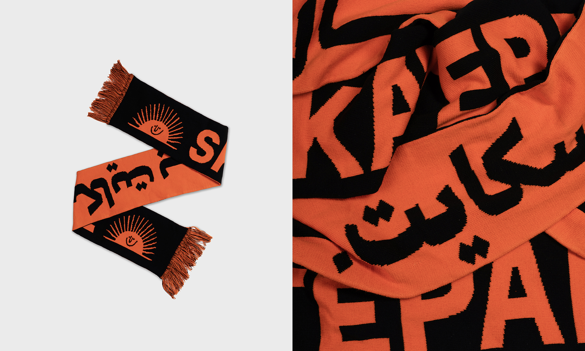
A clothing capsule celebrating 10 years of our largest and longest-running skatepark, located in Asira Ash-Shamaliya. Graphics inspired by various pieces of graffiti that have appeared on the ramps over the decade from both local skaters and international volunteers.
(8–11)
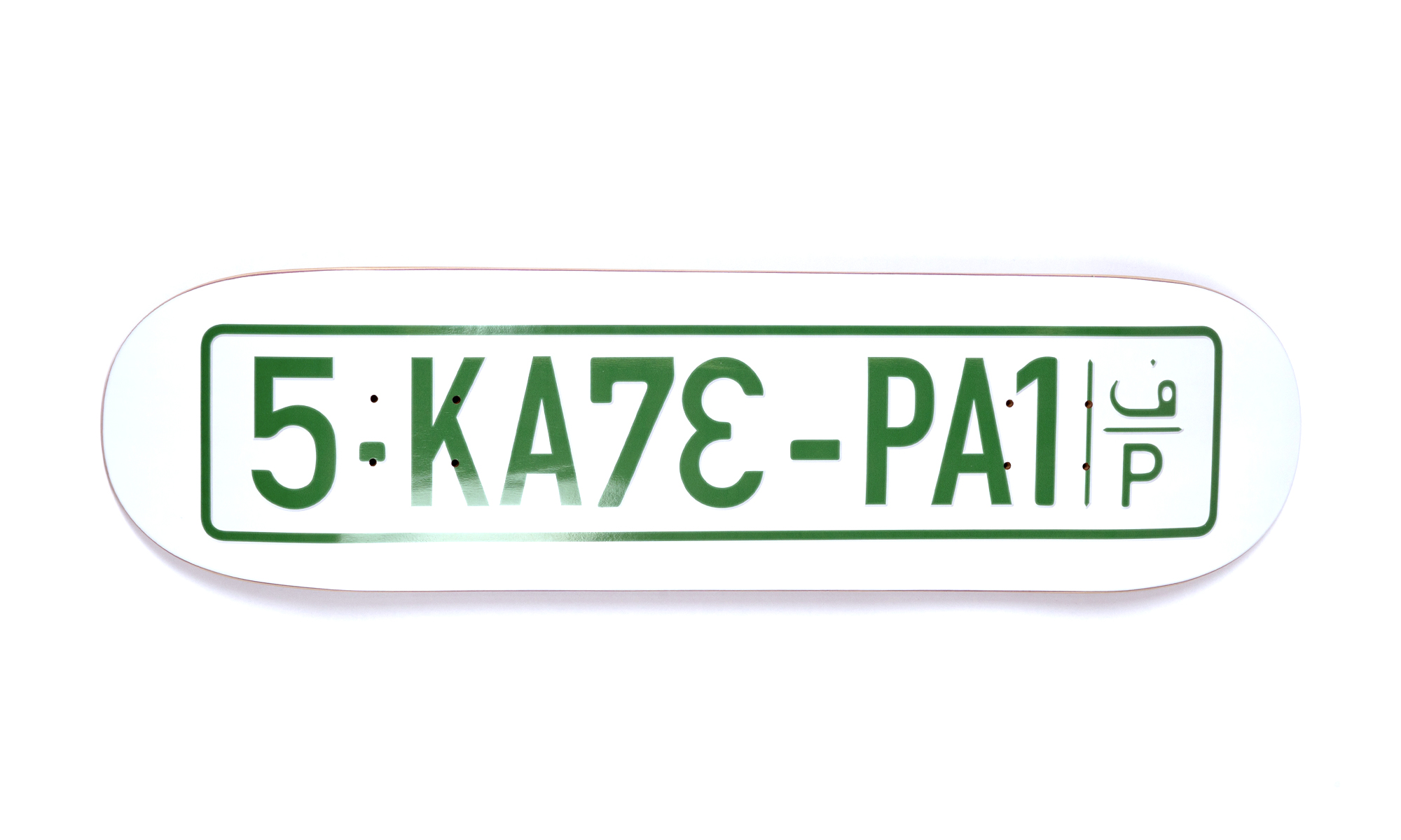
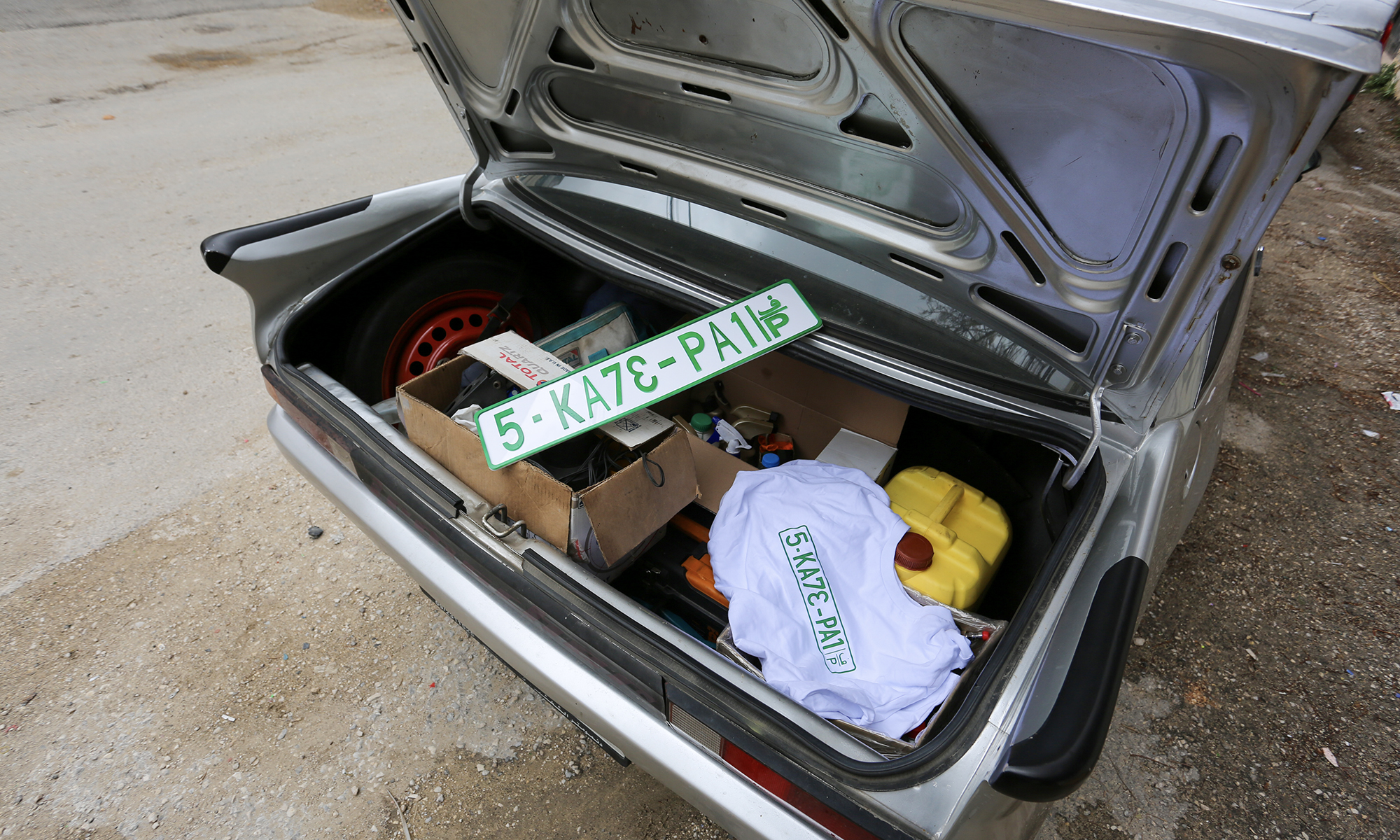
Licence Plate collection A graphic that gets to the heart of the occupation, highlighting the apartheid road system that exists in the West Bank: yellow plates for Israeli vehicles, green plates for Palestinian vehicles. Yellow plates drive freely, green plates endure severe restrictions, roadblocks and checkpoints.
(12-14)
Rajab tee
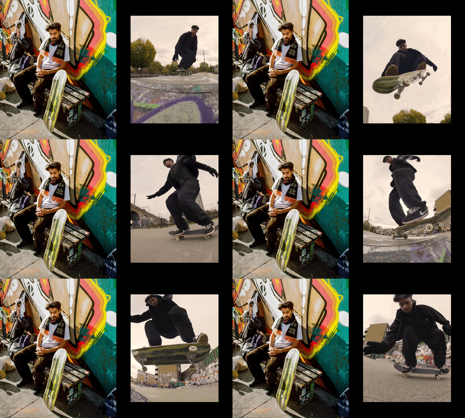
Released during the height of Israel’s military bombardment of Gaza, the tee features words and images of Rajab Al-Reefi, founder of Gaza Skate Team, doing a kickflip on a piece of rubble in the aftermath of air strikes. By the time a ceasefire was reached the tee had raised over £25,000 for Rajab and his family.
All products available for purchase via skatepal.co.uk/shop
READ MORE
Since 2013, SkatePal has supported young people in Palestine through skateboarding. But as our skate programmes increasingly transition over to locals partners, I joined the team to help SkatePal move into a new phase: to build a skateboard brand capable of supporting the scene for years to come. Here’s a snapshot of some favourite items I’ve designed:
(1–7)
10 Years of Asira
A clothing capsule celebrating 10 years of our largest and longest-running skatepark, located in Asira Ash-Shamaliya. Graphics inspired by various pieces of graffiti that have appeared on the ramps over the decade from both local skaters and international volunteers.
(8–11)
Licence Plate collection A graphic that gets to the heart of the occupation, highlighting the apartheid road system that exists in the West Bank: yellow plates for Israeli vehicles, green plates for Palestinian vehicles. Yellow plates drive freely, green plates endure severe restrictions, roadblocks and checkpoints.
(12-14)
Rajab tee
Released during the height of Israel’s military bombardment of Gaza, the tee features words and images of Rajab Al-Reefi, founder of Gaza Skate Team, doing a kickflip on a piece of rubble in the aftermath of air strikes. By the time a ceasefire was reached the tee had raised over £25,000 for Rajab and his family.
All products available for purchase via skatepal.co.uk/shop





SkatePal
Partnerships & Collabs
2024/25
Commercial work
Partnerships & Collabs
2024/25
Commercial work
A series of collaborative projects with artists, brands & collectives that help bring SkatePal’s mission to a broader international audience.
A huge part of building the SkatePal brand is curating a network of people around the world who connect with the organisation’s purpose and want to contribute to its voice. From arabic phrasebooks, to homemade shatta, to tatreez embroidery workshops, here are a selection of collaborations I’ve guided from idea to launch:
(1–3)
SkatePal x Fichier Caché
Fichier Caché are a Tunisian lifestyle brand whose vision is underpinned by the ethos ‘Born in struggle, thriving in chaos’. This collab capsule was inspired by our shared love of fruit stickers. Naturally, the deck took the shape of a fruit synonymous with Palestinian resistance.
(4–7)
SkatePal x Sabri Sundos
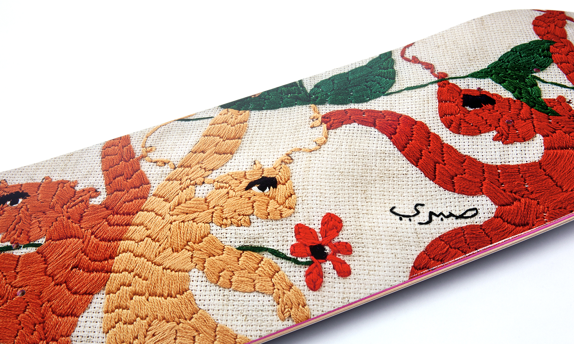
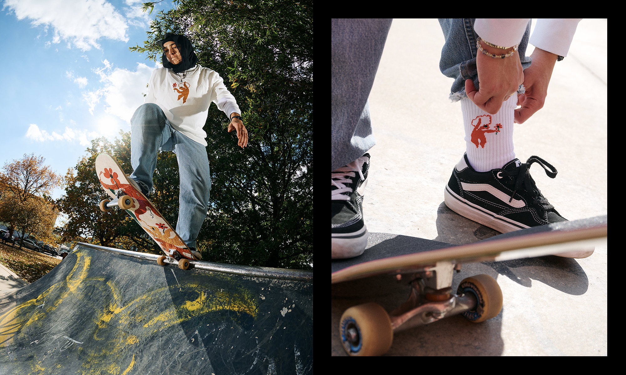
Sabri Sundos is an Palestinian-American artist whose work often incorporates a traditional form of Palestinian embroidery: ‘tatreez’. Together we designed a clothing collection based on his dancing figures – evoking the freedom of movement found in skateboarding – Sabri then hosted embroidery workshops in NYC, in which people could hand-embroider their own SkatePal tee.
(8–13)
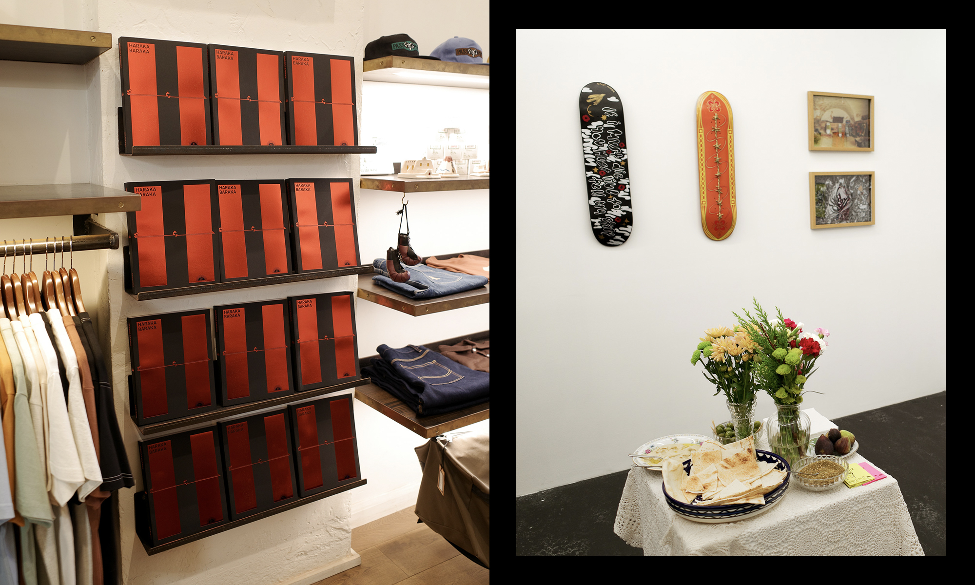
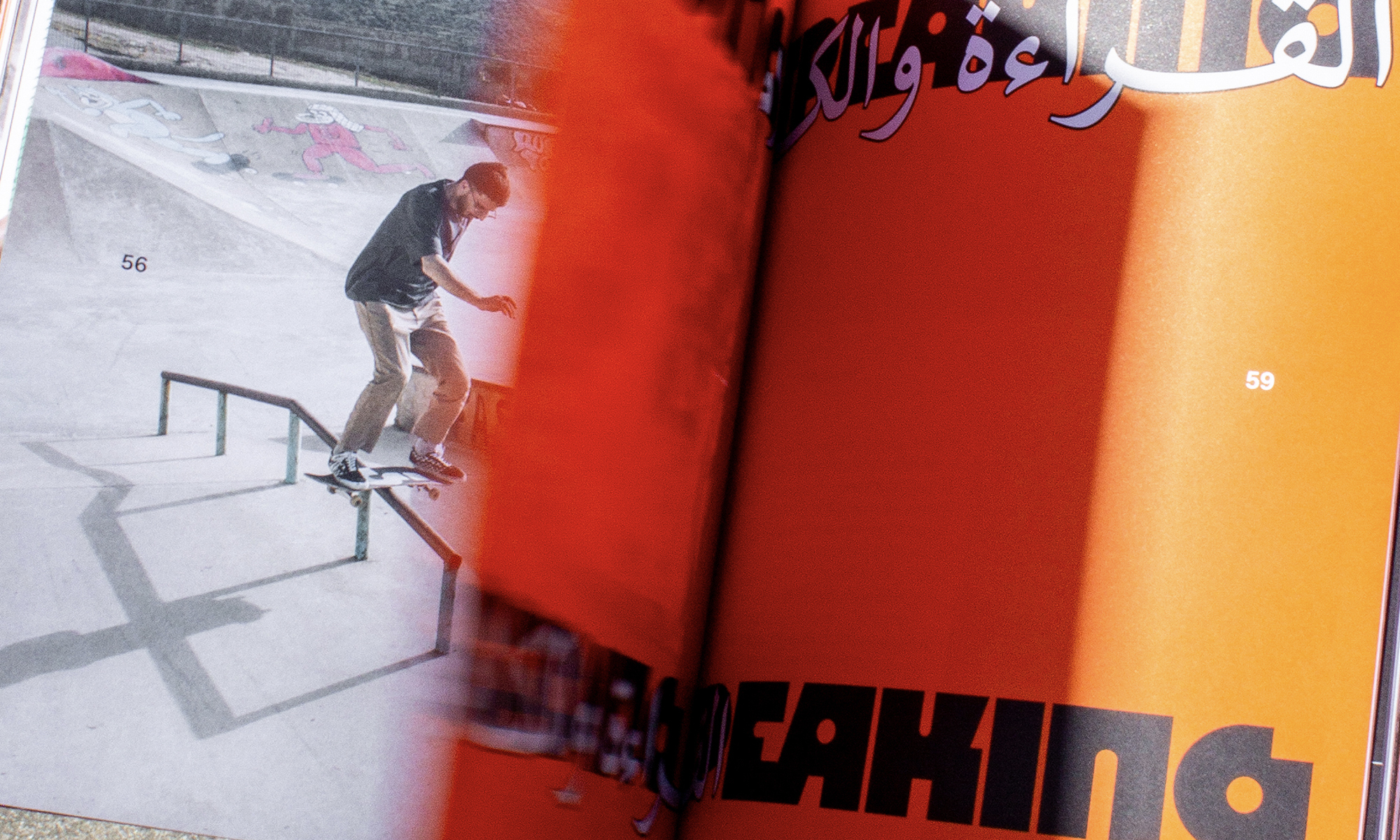
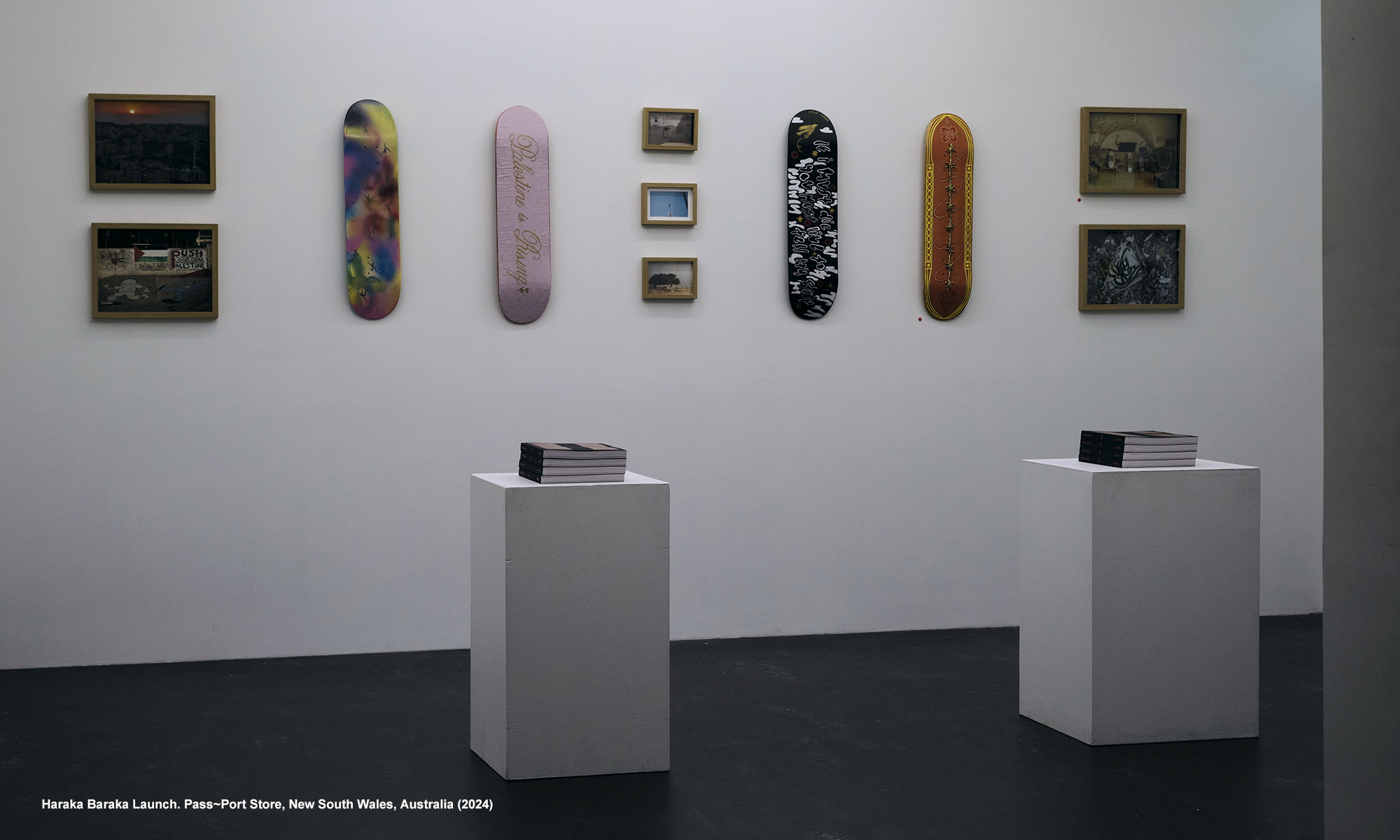
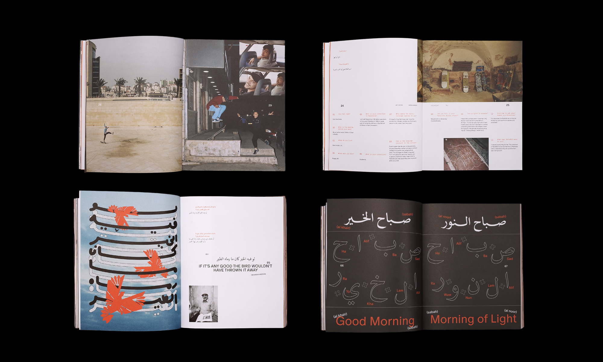
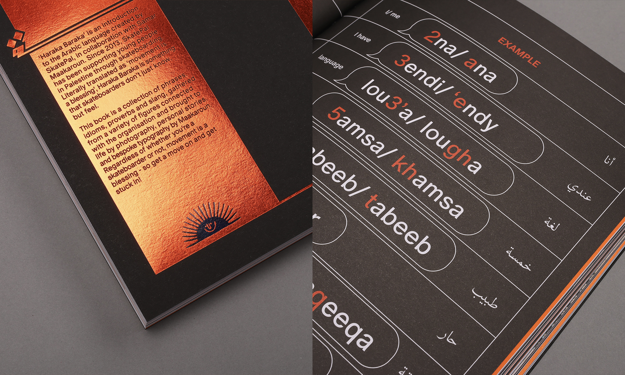
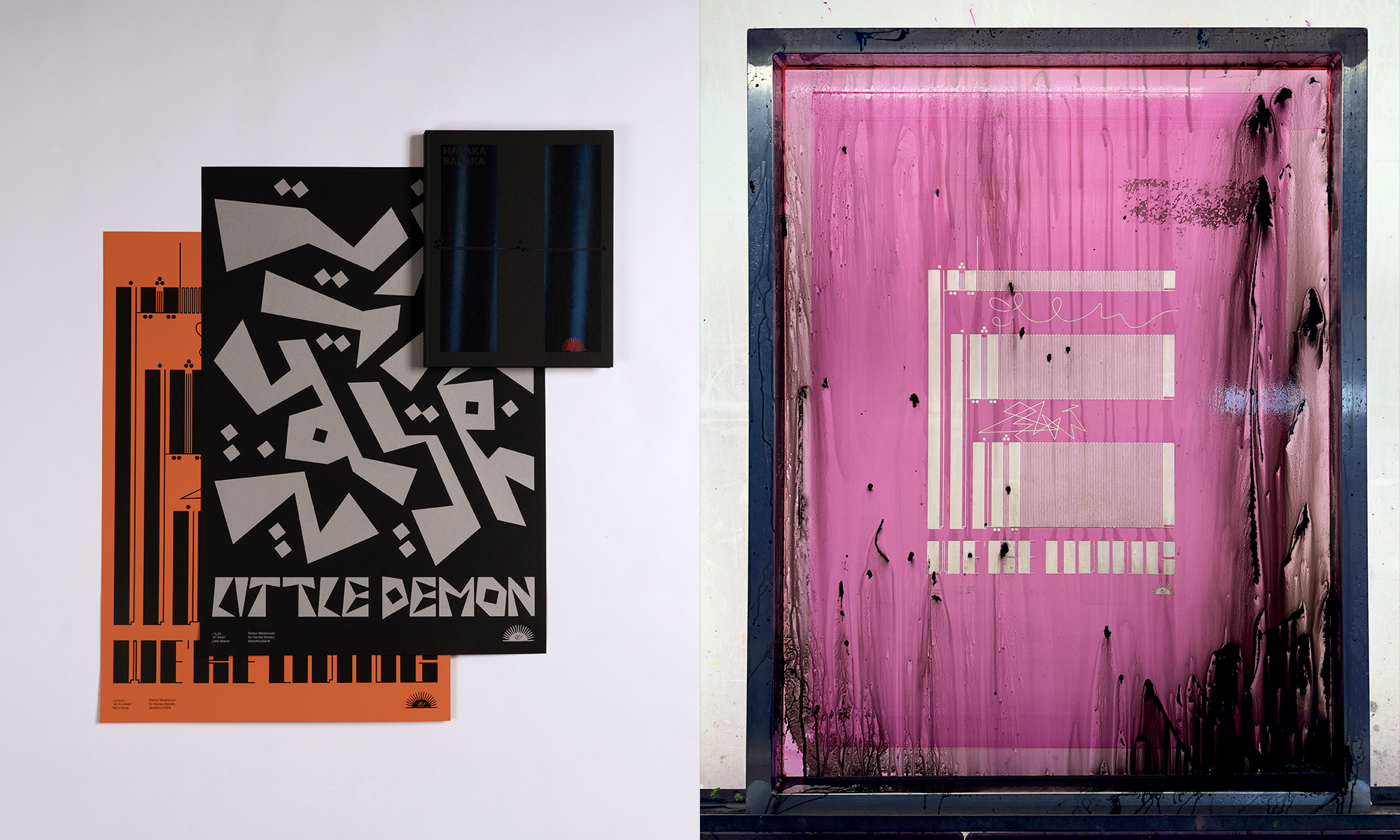
Haraka BarakaAn Arabic phrasebook developed by SkatePal and designed in collaboration with designer Samar Maakaroun. Offering a fun introduction to the Arabic language through a curated list of words and phrases from Palestine’s skateboarding community. We also designed a series typographic posters to launch alongside a limited-edition run of the book.
(14)
SkatePal x Fil In partnership with Fil, producers of artisanal ‘shatta’ (a Palestinian relish), we added a new product to their range, centred around the flavours found in Nablus: the ancestral home of Fil’s founders and location of SkatePal’s longest-running skatepark.
All products available for purchase via skatepal.co.uk/shop
READ MORE
A huge part of building the SkatePal brand is curating a network of people around the world who connect with the organisation’s purpose and want to contribute to its voice. From arabic phrasebooks, to homemade shatta, to tatreez embroidery workshops, here are a selection of collaborations I’ve guided from idea to launch:
(1–3)
SkatePal x Fichier Caché
Fichier Caché are a Tunisian lifestyle brand whose vision is underpinned by the ethos ‘Born in struggle, thriving in chaos’. This collab capsule was inspired by our shared love of fruit stickers. Naturally, the deck took the shape of a fruit synonymous with Palestinian resistance.
(4–7)
SkatePal x Sabri Sundos
Sabri Sundos is an Palestinian-American artist whose work often incorporates a traditional form of Palestinian embroidery: ‘tatreez’. Together we designed a clothing collection based on his dancing figures – evoking the freedom of movement found in skateboarding – Sabri then hosted embroidery workshops in NYC, in which people could hand-embroider their own SkatePal tee.
(8–13)
Haraka BarakaAn Arabic phrasebook developed by SkatePal and designed in collaboration with designer Samar Maakaroun. Offering a fun introduction to the Arabic language through a curated list of words and phrases from Palestine’s skateboarding community. We also designed a series typographic posters to launch alongside a limited-edition run of the book.
(14)
SkatePal x Fil In partnership with Fil, producers of artisanal ‘shatta’ (a Palestinian relish), we added a new product to their range, centred around the flavours found in Nablus: the ancestral home of Fil’s founders and location of SkatePal’s longest-running skatepark.
All products available for purchase via skatepal.co.uk/shop



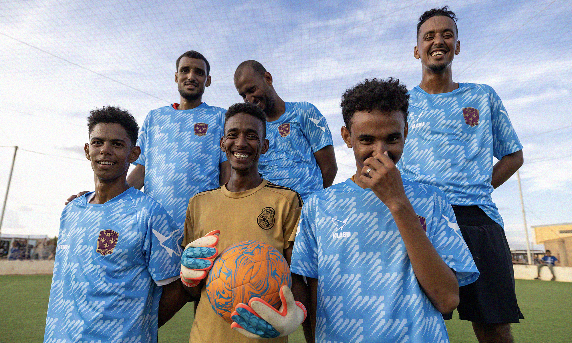
On x KLABU
Le Berrad
2025
Commercial work
Le Berrad
2025
Commercial work
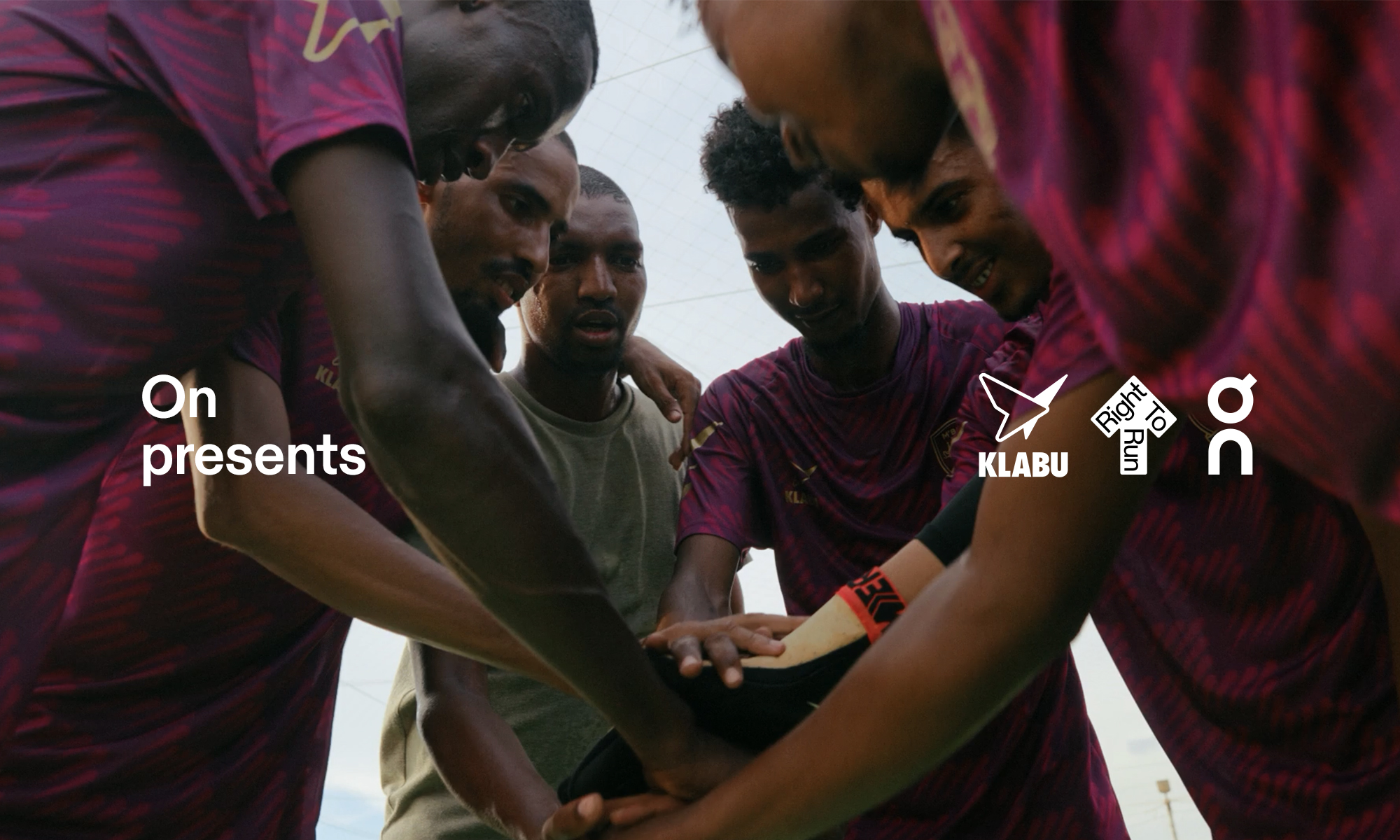
A story from the heart of the Saharan desert bringing together two of my favourite things: sport and tea.
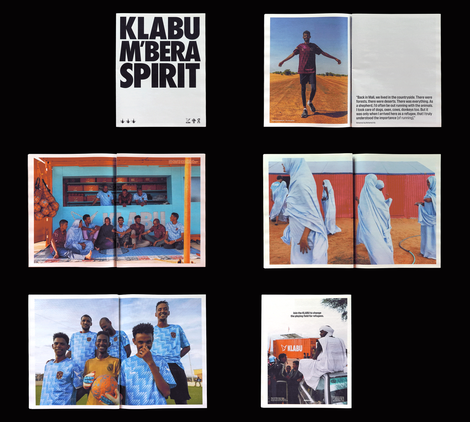
On the eastern border of Mauritania is a settlement called M’bera. Home to over 100,000 refugees displaced by the civil war in Mali, and the location of KLABU’s latest sports clubhouse.
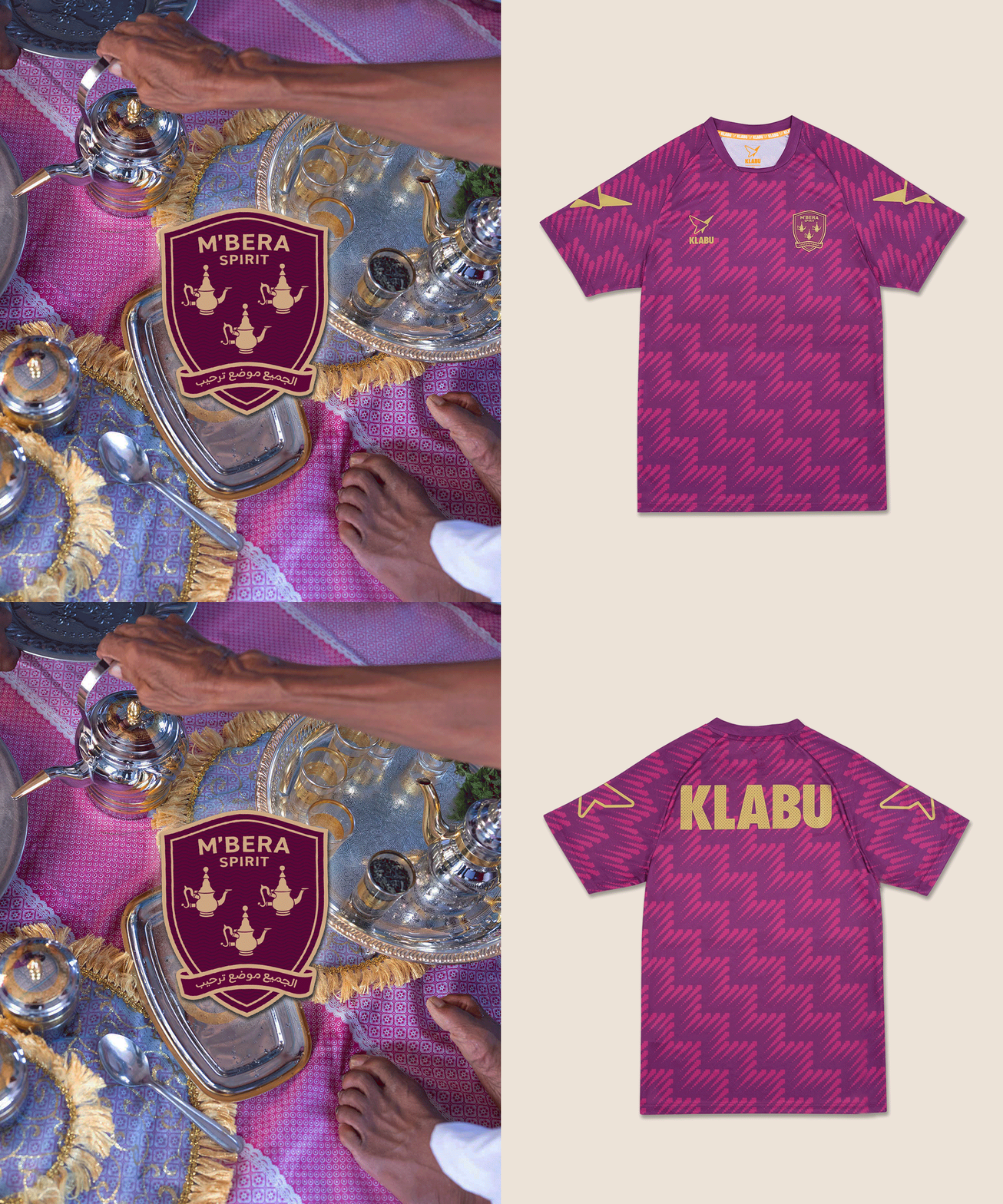
The badge on the KLABU M’bera shirt (5) features three traditional teapots, representing a welcome gesture in the Sahel where tea is poured in three servings:
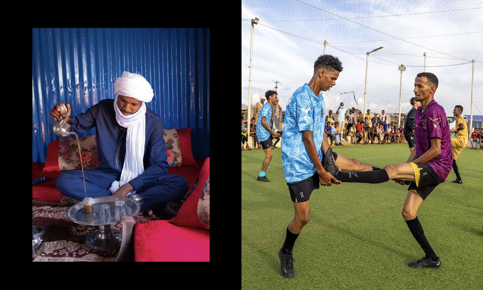
This phrase – a Tuareg proverb – served as a perfect metaphor describing the personal journey from displacement to reconnection, told here through the story of three characters living in M’bera: a runner, a footballer, and a volleyball player.
The film is scored by Tinariwen, an incredible band from the region, and this project marks the first of a 3-year partnership with On. Read more about it here.
Client ︎︎︎ On, KLABU
Creative Director ︎︎︎ Tom Bird
Director & DOP ︎︎︎ Richard Hu
Writer ︎︎︎ Tom Bird
Producer ︎︎︎ Julia Piatkowska, Fleur Harmsen, Ibrahim Ag Abdorahmane
Photography ︎︎︎ Coco Olakunle
Editor ︎︎︎ Richard Hu
Music ︎︎︎ Tinariwen
Music Licensing ︎︎︎ Lucy @ Warp, Patrick @ Wedge
Sound ︎︎︎ Wave Studios
Colour Grade ︎︎︎ Joppo de Grot
Cast ︎︎︎ Mohamed Ag Mohamed Aly
Mariama Wlt Med Ali
Aly Tahirou Macalou
Project partners ︎︎︎ On
UNHCR
Special thanks to Joumana Baalbaki, Jordan Farwell & Gessica Giulini @ On and UNHCR Mauritania.
READ MORE
On the eastern border of Mauritania is a settlement called M’bera. Home to over 100,000 refugees displaced by the civil war in Mali, and the location of KLABU’s latest sports clubhouse.
The badge on the KLABU M’bera shirt (5) features three traditional teapots, representing a welcome gesture in the Sahel where tea is poured in three servings:
“The first tea is served bitter, like loss.
The second is served strong, like life.
The third is served sweet, like love.”
This phrase – a Tuareg proverb – served as a perfect metaphor describing the personal journey from displacement to reconnection, told here through the story of three characters living in M’bera: a runner, a footballer, and a volleyball player.
The film is scored by Tinariwen, an incredible band from the region, and this project marks the first of a 3-year partnership with On. Read more about it here.
Client ︎︎︎ On, KLABU
Creative Director ︎︎︎ Tom Bird
Director & DOP ︎︎︎ Richard Hu
Writer ︎︎︎ Tom Bird
Producer ︎︎︎ Julia Piatkowska, Fleur Harmsen, Ibrahim Ag Abdorahmane
Photography ︎︎︎ Coco Olakunle
Editor ︎︎︎ Richard Hu
Music ︎︎︎ Tinariwen
Music Licensing ︎︎︎ Lucy @ Warp, Patrick @ Wedge
Sound ︎︎︎ Wave Studios
Colour Grade ︎︎︎ Joppo de Grot
Cast ︎︎︎ Mohamed Ag Mohamed Aly
Mariama Wlt Med Ali
Aly Tahirou Macalou
Project partners ︎︎︎ On
UNHCR
Special thanks to Joumana Baalbaki, Jordan Farwell & Gessica Giulini @ On and UNHCR Mauritania.



Nike x Oranjeleeuwen
Oranje Fatalis
2025
Commercial work
Oranje Fatalis
2025
Commercial work
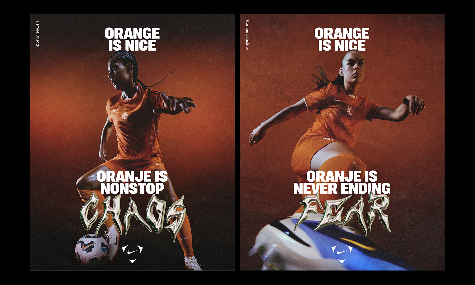
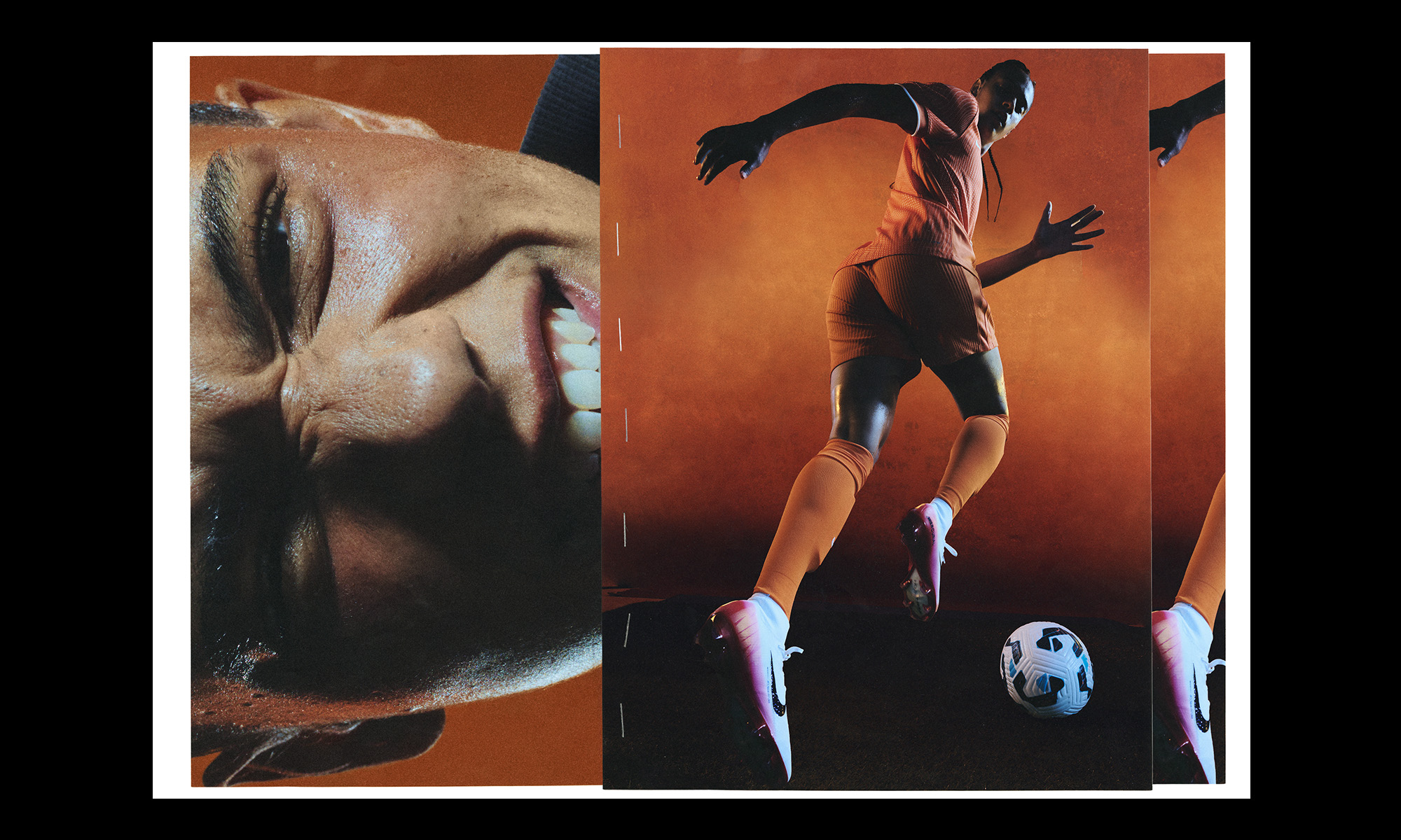
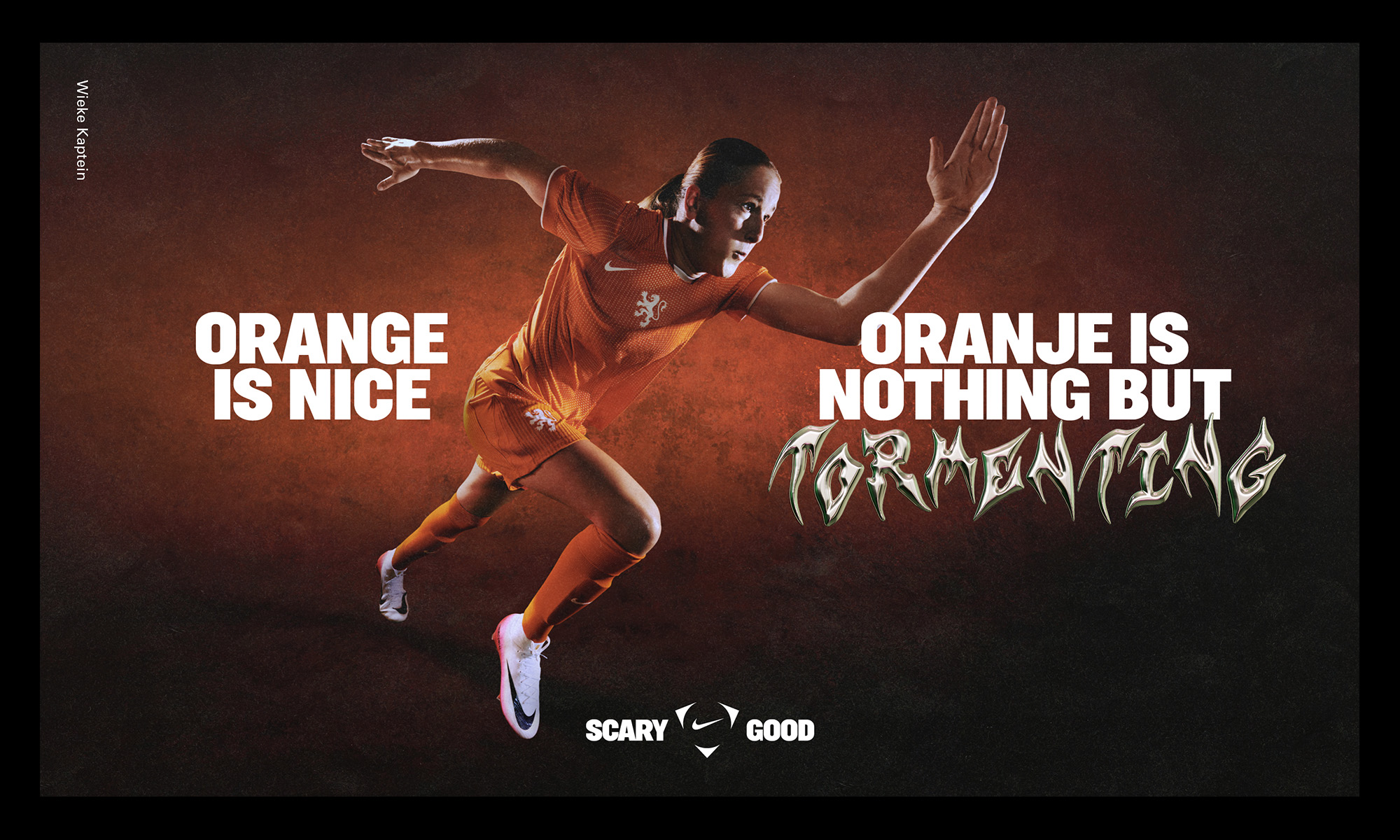
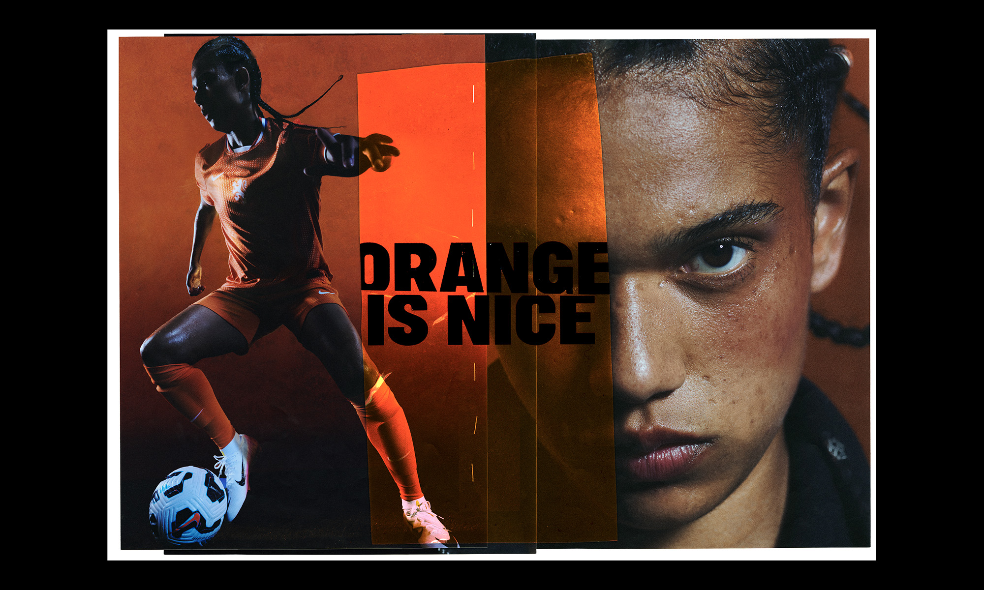
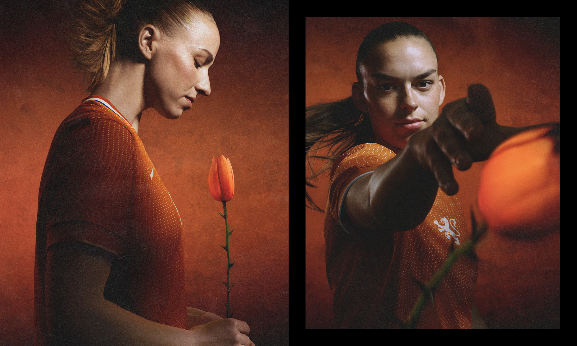
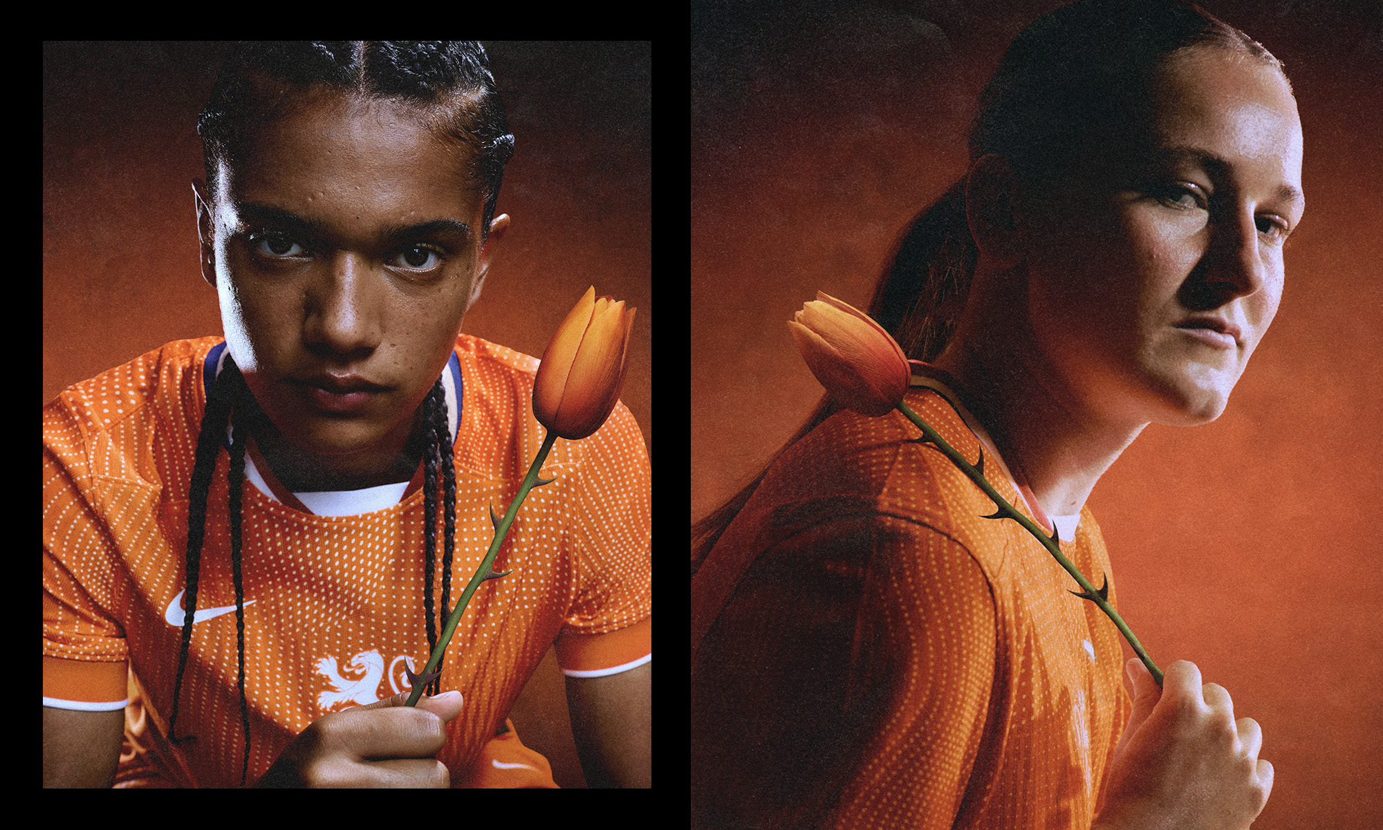
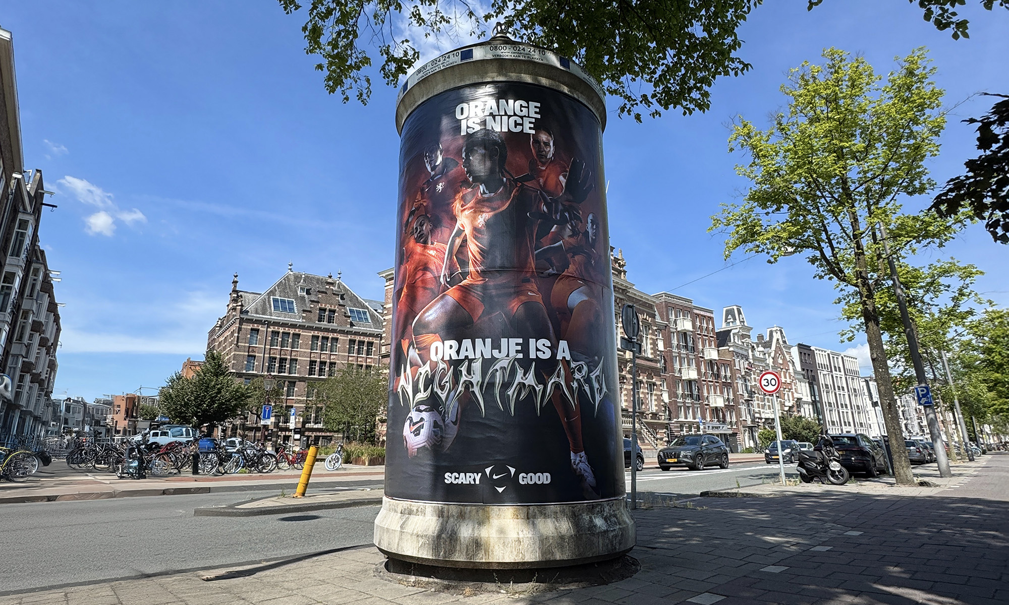
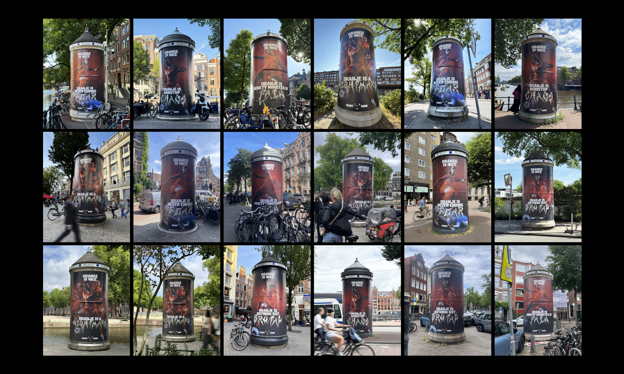
Orange is nice, unless you have to share a pitch with it. Some scare tactics to strike fear into opponents ahead of the Euros.
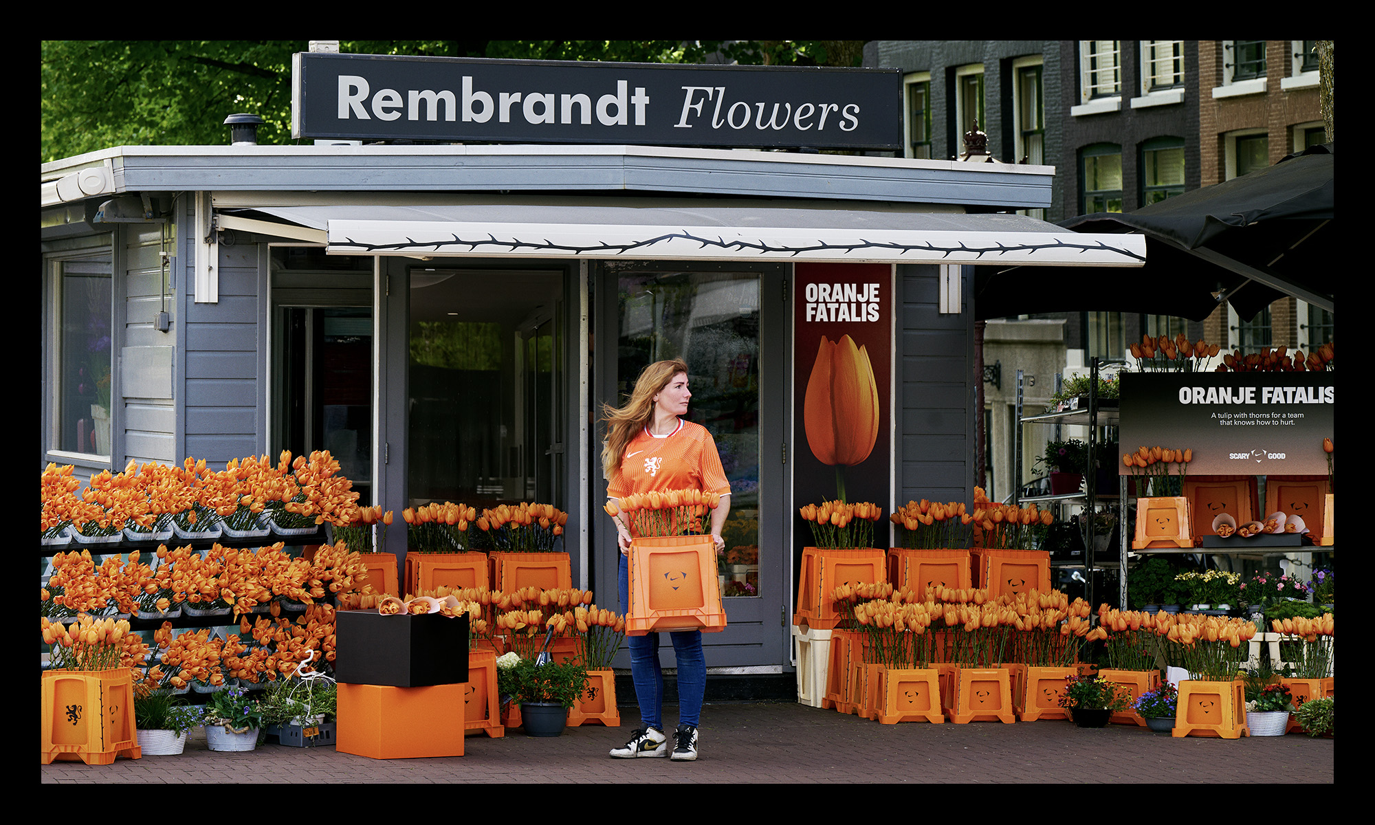
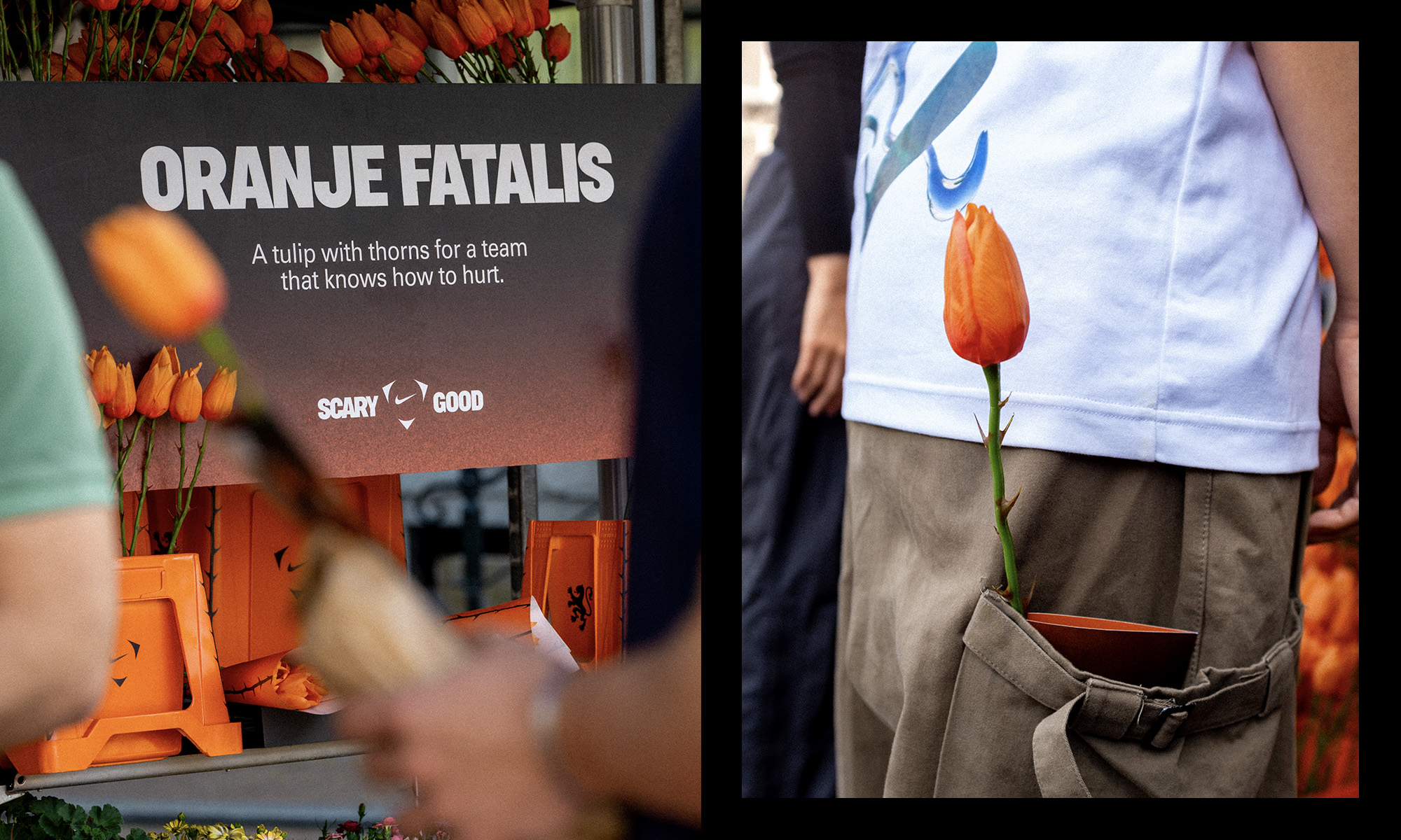
To celebrate the Netherlands women’s football team and taunt rivals in the run up to Euro 2025, we revised one of the most iconic national symbols: introducing Oranje Fatalis – a tulip with thorns, for a team that knows how to hurt.
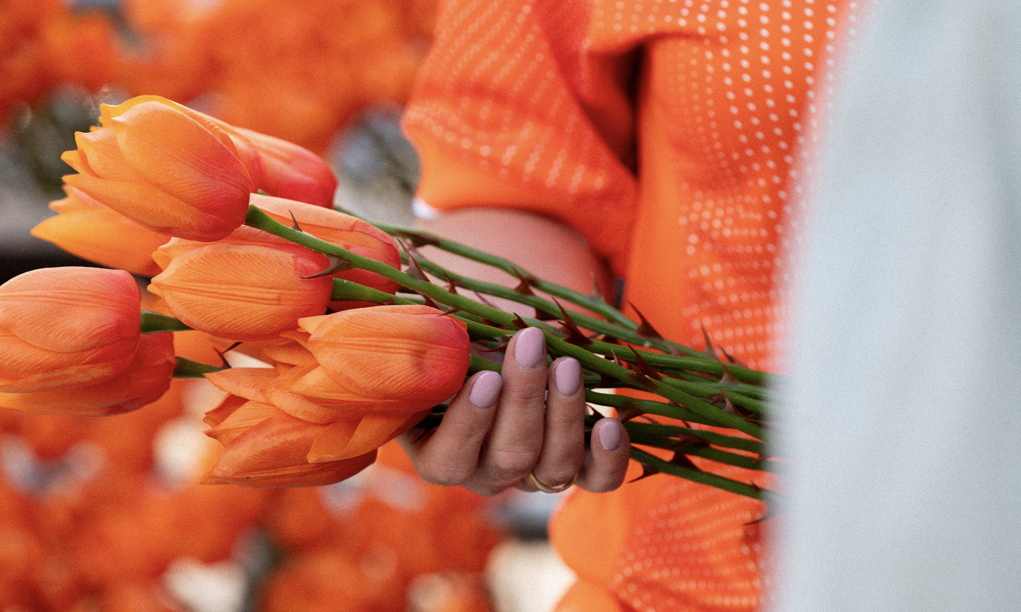
Created in collaboration with Dutch silk flower specialists Bloom & Wolf, Oranje Fatalis is a new strain of tulip representing the character and fear factor of the ‘OranjeLeeuwinnen’ as they set their sights on European glory.
These thorned tulips took over flower stalls across Amsterdam before the opening fixture of the tournament, while prickly bouquets were sent to the opposing team’s changing room before kick-off.
**this is the only piece of work in my portfolio where I did not develop the initial concept, however I led the project through production, shooting across three different countries, and across final design**
Client ︎︎︎ Nike Football & KNVB
Agency ︎︎︎ Wieden + Kennedy Amsterdam
Creative Director ︎︎︎ Zeynep Orbay
Executive Producer ︎︎︎ Khalid El Khouani
Art Director ︎︎︎ Tom Bird, Christian Baur
Copywriter ︎︎︎ Allen Stephenson
Designer ︎︎︎ Shen Hou
Producer ︎︎︎ Saltanat Ibraeva, Isaac Chukwumah
Account Handler ︎︎︎ Hannah Heidar
Photographers ︎︎︎ Alma de Ricou + Manon Engel @ Division
Retouch ︎︎︎ INK, Paris
Featuring ︎︎︎ Esmee Brugts
Jil Roord
Romeé Leuchter
Jackie Groenen
Wieke Kaptein
READ MORE
To celebrate the Netherlands women’s football team and taunt rivals in the run up to Euro 2025, we revised one of the most iconic national symbols: introducing Oranje Fatalis – a tulip with thorns, for a team that knows how to hurt.
Created in collaboration with Dutch silk flower specialists Bloom & Wolf, Oranje Fatalis is a new strain of tulip representing the character and fear factor of the ‘OranjeLeeuwinnen’ as they set their sights on European glory.
These thorned tulips took over flower stalls across Amsterdam before the opening fixture of the tournament, while prickly bouquets were sent to the opposing team’s changing room before kick-off.
**this is the only piece of work in my portfolio where I did not develop the initial concept, however I led the project through production, shooting across three different countries, and across final design**
Client ︎︎︎ Nike Football & KNVB
Agency ︎︎︎ Wieden + Kennedy Amsterdam
Creative Director ︎︎︎ Zeynep Orbay
Executive Producer ︎︎︎ Khalid El Khouani
Art Director ︎︎︎ Tom Bird, Christian Baur
Copywriter ︎︎︎ Allen Stephenson
Designer ︎︎︎ Shen Hou
Producer ︎︎︎ Saltanat Ibraeva, Isaac Chukwumah
Account Handler ︎︎︎ Hannah Heidar
Photographers ︎︎︎ Alma de Ricou + Manon Engel @ Division
Retouch ︎︎︎ INK, Paris
Featuring ︎︎︎ Esmee Brugts
Jil Roord
Romeé Leuchter
Jackie Groenen
Wieke Kaptein
WeTransfer
Move it like a Pro
2024
Commercial work
Move it like a Pro
2024
Commercial work
A campaign that makes upgrading to WeTransfer Pro a no-brainer for even the least professional pro’s.
WeTransfer had a problem: 80-million users, yet less than 1% paid for a WeTransfer Pro account.
So how do you talk to designers / photographers / filmmakers / editors / retouchers / sound engineers / location scouts / casting reps / production managers and all other fish swimming in this soup we call ‘the creative industry’?
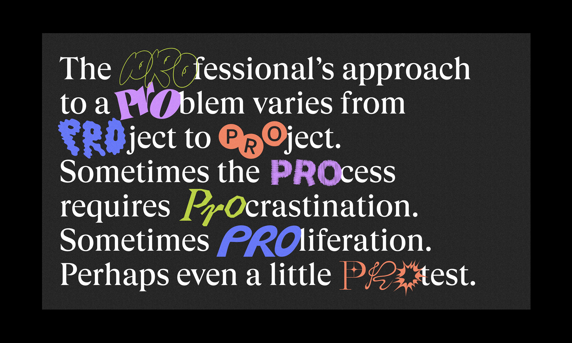
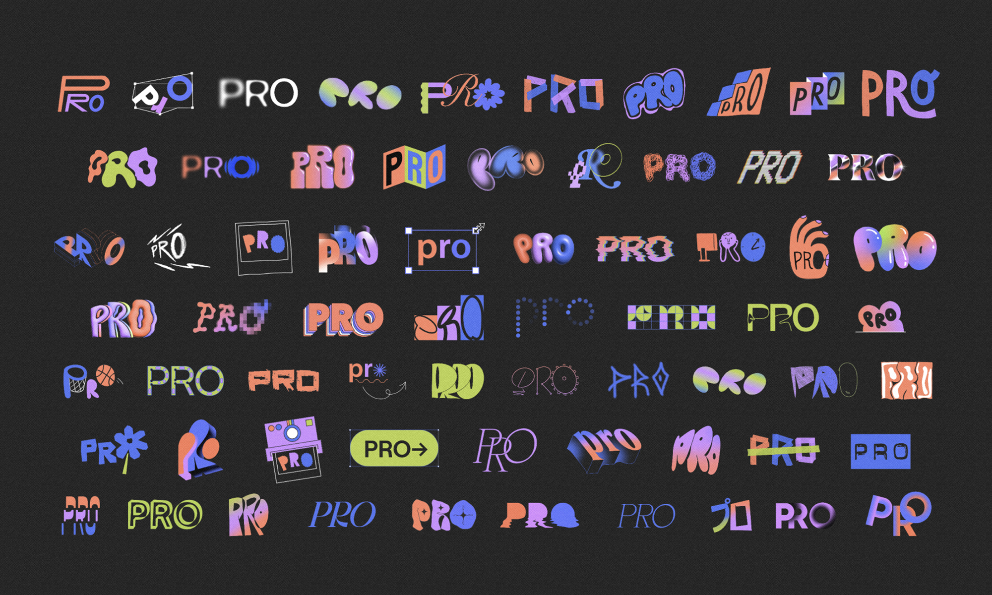
Everyone’s a professional in their own way, so we locked onto that word – pro – and designed a bazillion iterations, one for every creative profession (not quite 80-million, but a lot), then bounced this prefix around the English language like a beach ball, constructing playful messages for all kinds of people about all manner of things.
We then asked some proper pros... the likes of Gabriel Moses, Joshua Kissi, Jessica Walsh and Quinn Wilson ...to show us what being a true professional looks like – sharing glimpses of their creative process lurking on their mobile – which we then turned into a series of idents.
The campaign played out across WeTransfer, WePresent and Instagram.
Head of Studio ︎︎︎ Marc Vermeeren, Keith Butters
Design Director ︎︎︎ Pia Vivo
Creative Directors ︎︎︎ Tom Bird & Tom Biddulph
Art Direction ︎︎︎ Pia Vivo, Fin O’Neill, Tom Bird
Copywriter ︎︎︎ Tom Biddulph, Tom Bird, Abbie Robinson
Motion Design ︎︎︎ Everton Guilherme, Nacho Darras
Graphic Design ︎︎︎ Nathan Hoang, Terezie Štindlová
Project Manager ︎︎︎ Hannah Mullen
Producer ︎︎︎ Vera le Blanc, Linsey Ruijter
Animation Partner ︎︎︎ BUCK
WePresent Director ︎︎︎ Holly Fraser
Music ︎︎︎ Suzi Analog (licenced via WARP)
READ MORE
WeTransfer had a problem: 80-million users, yet less than 1% paid for a WeTransfer Pro account.
So how do you talk to designers / photographers / filmmakers / editors / retouchers / sound engineers / location scouts / casting reps / production managers and all other fish swimming in this soup we call ‘the creative industry’?
Everyone’s a professional in their own way, so we locked onto that word – pro – and designed a bazillion iterations, one for every creative profession (not quite 80-million, but a lot), then bounced this prefix around the English language like a beach ball, constructing playful messages for all kinds of people about all manner of things.
We then asked some proper pros... the likes of Gabriel Moses, Joshua Kissi, Jessica Walsh and Quinn Wilson ...to show us what being a true professional looks like – sharing glimpses of their creative process lurking on their mobile – which we then turned into a series of idents.
The campaign played out across WeTransfer, WePresent and Instagram.
Head of Studio ︎︎︎ Marc Vermeeren, Keith Butters
Design Director ︎︎︎ Pia Vivo
Creative Directors ︎︎︎ Tom Bird & Tom Biddulph
Art Direction ︎︎︎ Pia Vivo, Fin O’Neill, Tom Bird
Copywriter ︎︎︎ Tom Biddulph, Tom Bird, Abbie Robinson
Motion Design ︎︎︎ Everton Guilherme, Nacho Darras
Graphic Design ︎︎︎ Nathan Hoang, Terezie Štindlová
Project Manager ︎︎︎ Hannah Mullen
Producer ︎︎︎ Vera le Blanc, Linsey Ruijter
Animation Partner ︎︎︎ BUCK
WePresent Director ︎︎︎ Holly Fraser
Music ︎︎︎ Suzi Analog (licenced via WARP)